


OBJECTIVE
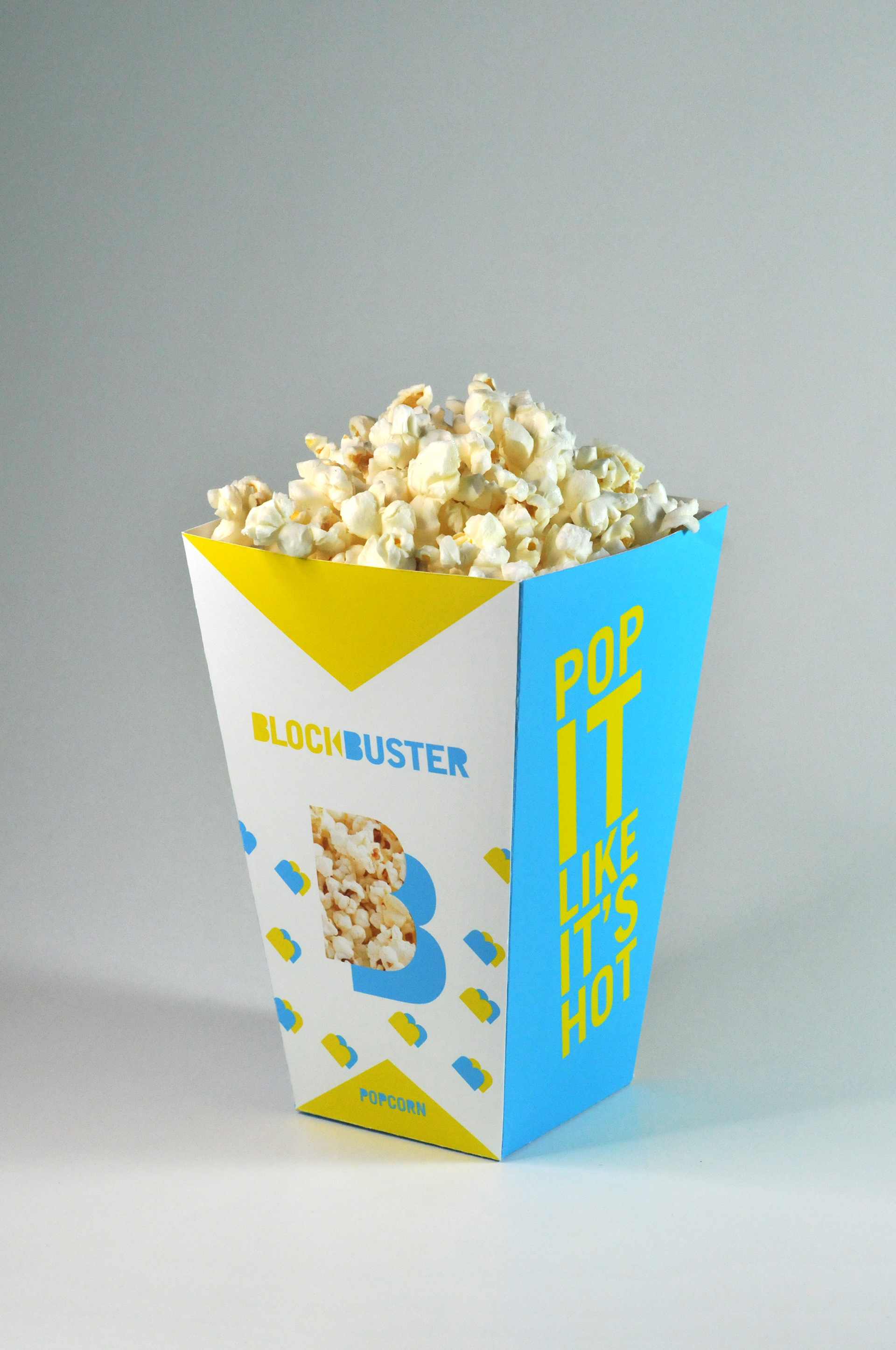
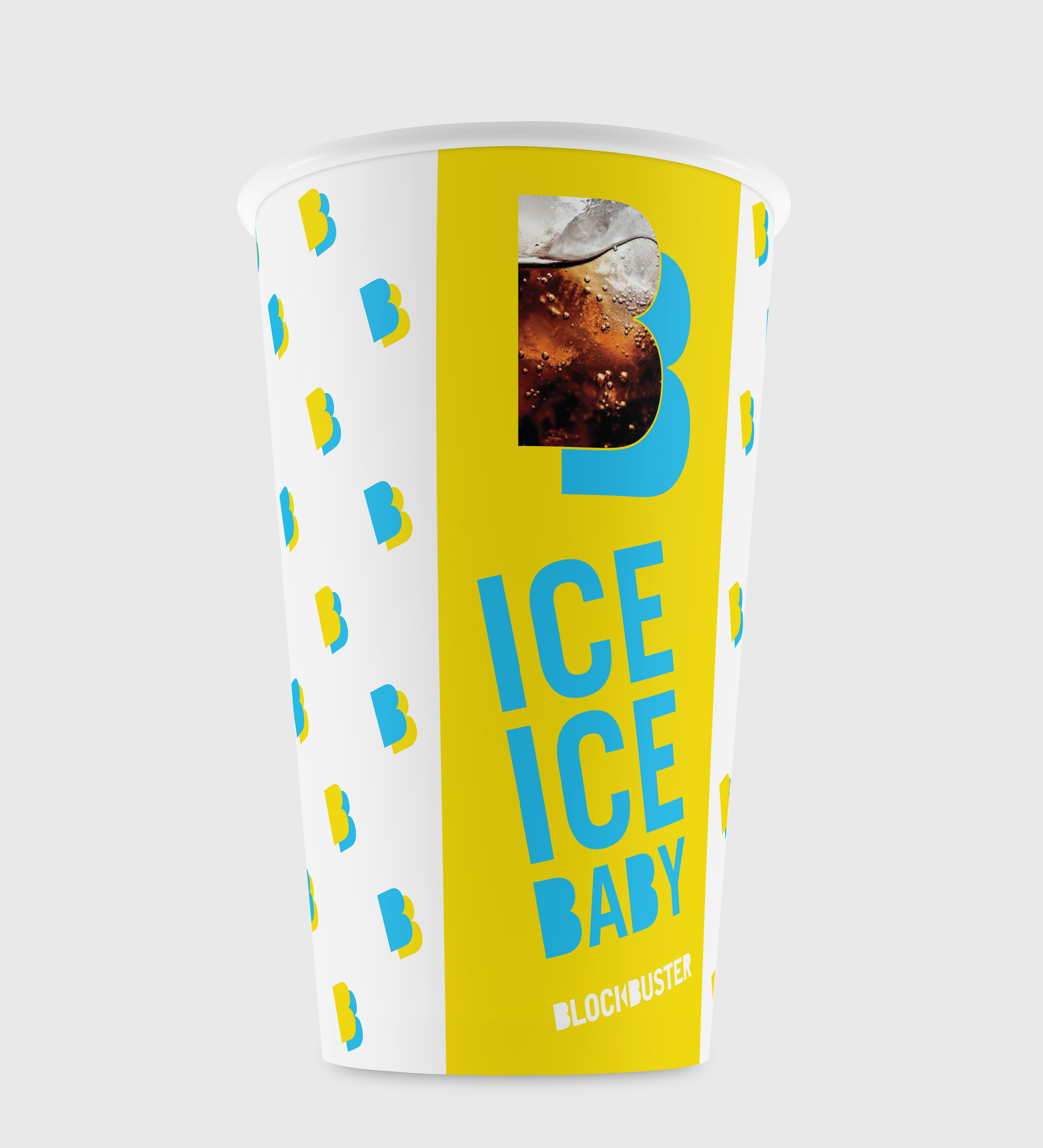
In a group pick a company that needs to be rebranded. The rebrand must include research and development on why a rebranding of this company is necessary and the goals, a brand book showcasing the new branding including logo, typography, color, and execution of the brand on a variety of appropriate mediums.
SOLUTION
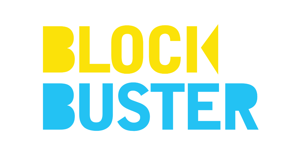
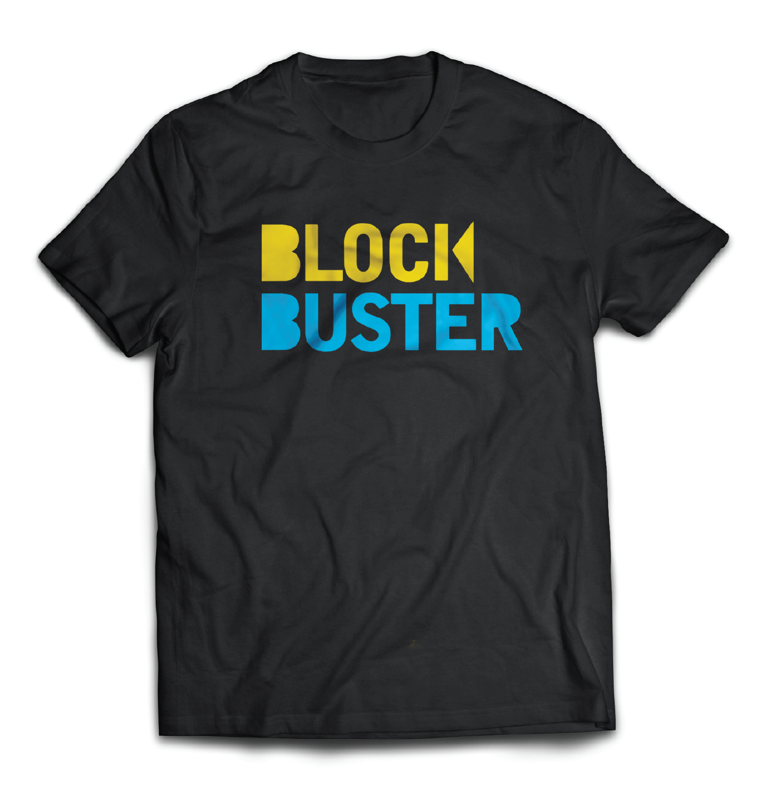
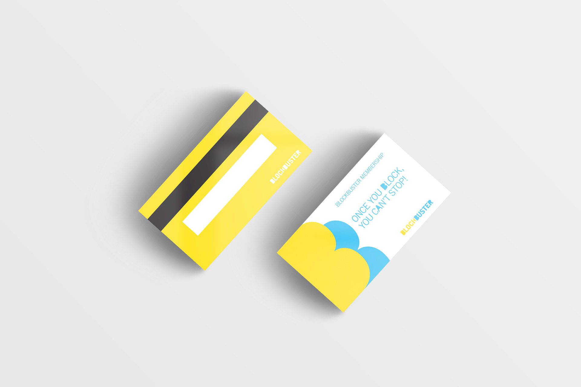
Myself and three other students chose to rebrand Blockbuster, a company we all grew up with and were sad to see go. A huge part of this project was the conception behind the idea and the reasoning for rebranding. Our solution for the logo was to embrace the past and the nostalgia of the bran, while bringing it into the new digital era. To do this we chose bold block typography with a “rewind” symbol in the k to represent our past. We chose to keep the same color scheme of blue and yellow, but to make them more vibrant and playful.
This project allowed the four of us to all collaborate and take lead on certain design executions. Due to my passion and history in film, I took lead on creating a brand video and commercial for the project.
The purpose of the brand video is to show our audience who Blockbuster was and who they are now as a new company. Part of why we as a group decided that Blockbuster would have a chance of a comeback in this day and age is the demand from the people who grew up with video stores. Because of this, we decided to get testimonials from people about their favorite memories in a Blockbuster, and why film as an art form is important to them. I acted as the director and editor of the film with Christian Banks providing the intro and outro to the video. The concept was created by myself, Christian, Jessica Martinelli and Robin DeBold.
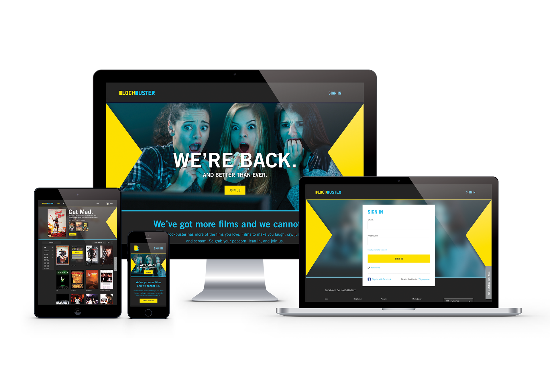
In addition, I came up with the idea for this commercial based on tagline "We're Back". I thought it was only appropriate to use footage from famous films saying phrases about returning to get people excited about the new and improved Blockbuster.