Objective
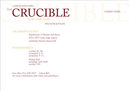
Design a three-part series of postcards to advertise The Crucible at Sacramento State. The postcards must use photography of paper as the main imagery. The postcards should work as a system as well as individually with all three sharing a back.
Additionally, design a short video using the same system as the postcards to provide further advertisement. The video is to be under twenty seconds long and include video and sound.
Solution
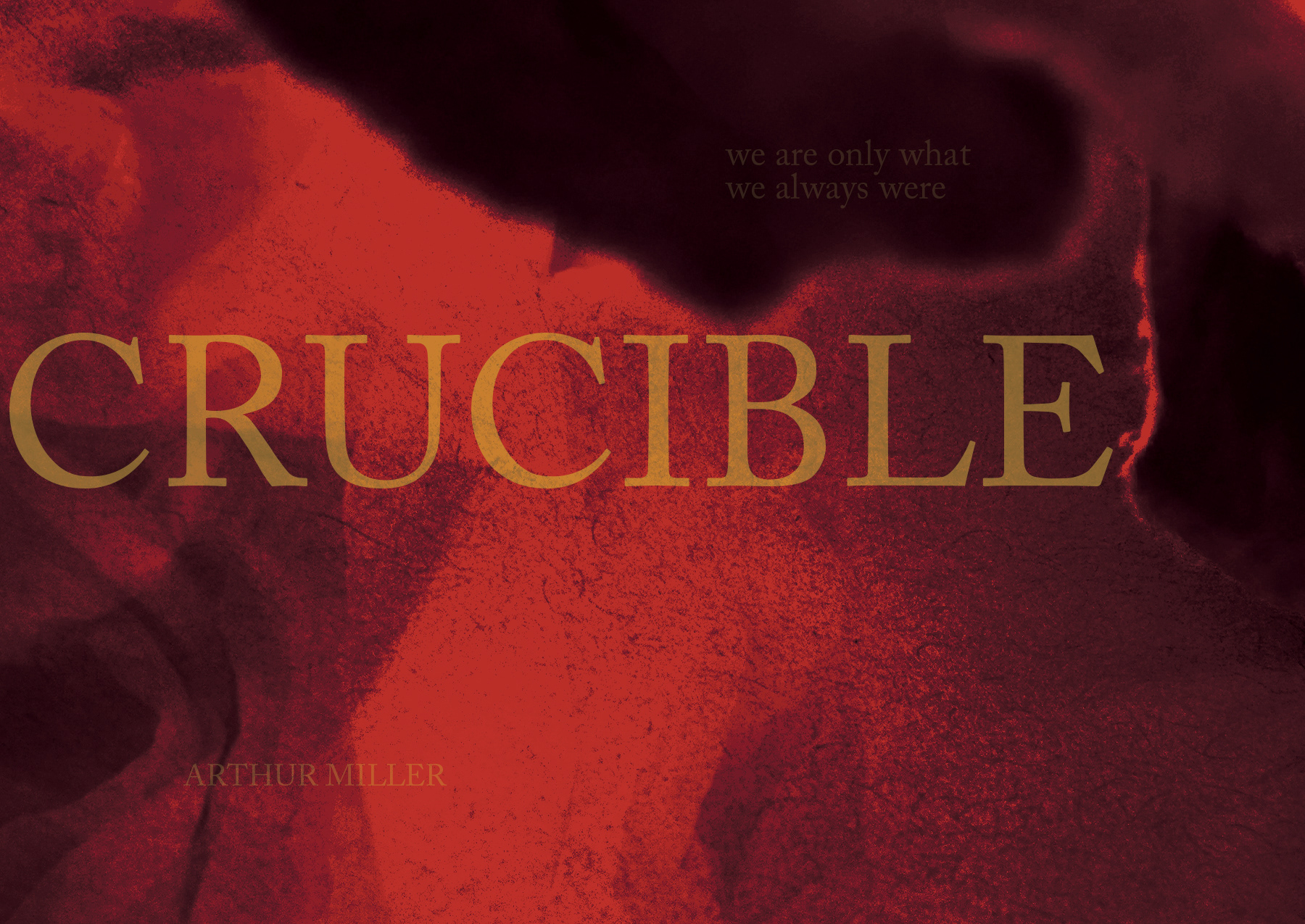
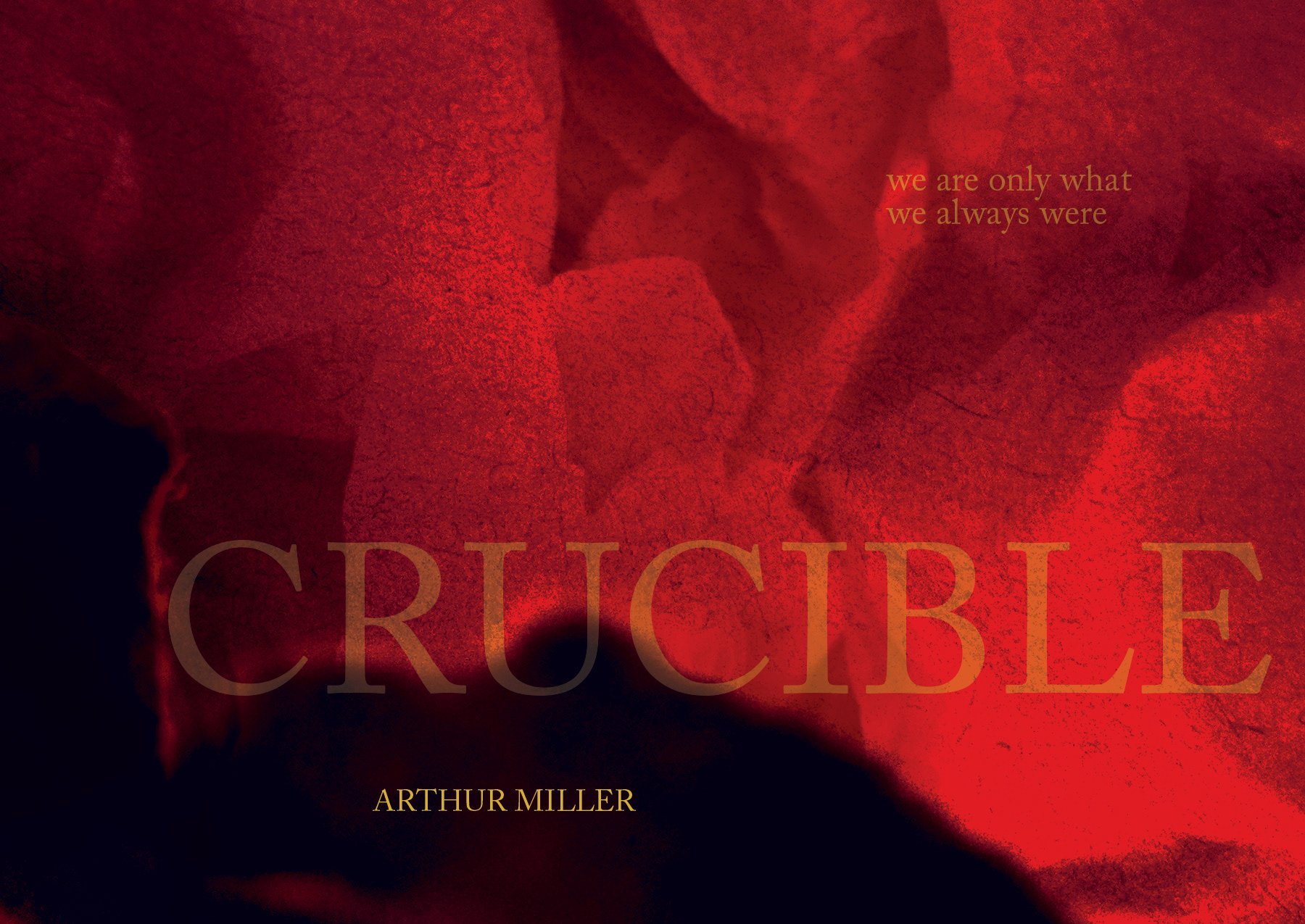
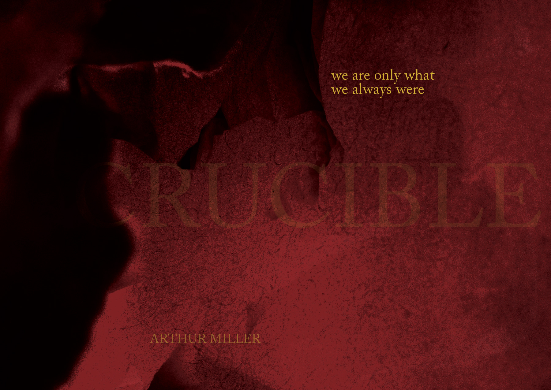
The Crucible is about a group of young girls whose behavior causes unrest in their small town of Salem in the late 1600’s. Controversy and social status lead the town into mayhem and result in a strong man to make a sacrifice. The play is brimming with themes of intolerance, hysteria, reputation, and legal proceedings.
I decided to focus on these themes and incorporate the quote “we are only what we always were”, a line I believe represents the tone and message of the entire play. Each postcard highlights a different typographic element with “Crucible” being the most prominent in the first and slowly fading. The quote is almost invisible and gets more prominent until its the main focus in the final postcard. This represents the themes of reputation and everything not being quite what it seems in the beginning. The color and texture represent the fire and hate present in the play.
The video takes the cards and enhances them with video of fire and light to highlight the play's name, author, and quote. It opens up a the end to show the play dates and information with the sound of a gavel to make them appear. The whispering heard throughout the video builds a sense of dread and represents the secrets and gossip that fuel the play.